Self-service kiosks are popping up everywhere, from airports to fast-food restaurants, offering a modern way for customers to check in, order food, or make purchases without waiting in long lines. These kiosks have become essential for businesses seeking to improve efficiency and streamline operations.
However, as convenient as they are, self-service kiosks only work if the user experience (UX) is spot on. If customers find them confusing or difficult to use, the benefits can quickly become frustrating.
Designing an easy-to-use kiosk might sound easy, but the challenges in their UX design are very real. From complicated menus to poor accessibility features, minor design flaws can make a simple task a headache.
In this blog, we’ll explore common challenges in the UX design of self-service kiosks and offer practical solutions. By tackling these issues, businesses can create user-friendly kiosks and leave customers satisfied and eager to use them again.
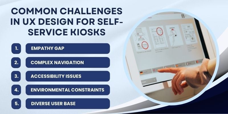
Common Challenges in UX Design for Self-Service Kiosks

Self-service kiosks are becoming common in airports, restaurants, and retail stores. They provide customers with a quick and efficient way to check in, order food, or purchase. While these kiosks offer great convenience, ensuring users have a smooth and effortless experience is key to their success.
If the kiosk’s interface is confusing or difficult to navigate, users may quickly become frustrated and abandon the kiosk. Therefore, it’s important to address the common user experience challenges in kiosks to avoid these issues.
Below, we explore five major design problems in self-service kiosks and offer solutions to make them more intuitive and user-friendly:
1. Empathy Gap
The empathy gap occurs when designers overlook users’ needs and focus too much on functionality or business goals. For example, a kiosk might have a complicated multi-step process that confuses users, especially those less familiar with technology.
This is a significant UX design difficulty, as it can make users feel frustrated and overwhelmed. For example, older adults or less tech-savvy individuals may struggle with unclear navigation or small icons, resulting in them abandoning the process.
To close the empathy gap, designers must deeply understand the users’ perspectives through regular testing and feedback. This will help ensure the kiosk is designed to meet their specific needs.
2. Complex Navigation
A kiosk that’s hard to navigate will create significant frustration for users. Long or complicated menus with too many options can overwhelm users and lead them to walk away.
For example, airport kiosks where passengers must go through multiple screens to confirm flight details are a classic example of design problems in self-service kiosks.
Therefore, navigation must be simple. Streamlined menus, logical categorization of options, and more precise instructions can make all the difference. Making the process easy to follow and reducing the number of steps ensures customers can complete their tasks without stress or confusion.
3. Accessibility Issues

Another major issue with kiosk UX design is accessibility. Everyone should be able to use kiosks regardless of physical abilities or digital literacy. Features like small text or touch interfaces that require fine motor skills can create barriers for users with disabilities.
To address these issues, designers should focus on making kiosks accessible to many users. Options like larger text, high-contrast colors, and audio assistance can make kiosks more inclusive.
To create a more welcoming experience for users with different needs, the kiosk should be responsive to different touch pressures, provide screen readers, and offer alternative interaction methods.
4. Environmental Constraints
The physical environment significantly affects how easy it is to use a kiosk. For example, kiosks placed in direct sunlight may suffer from screen glare, making them hard to read. Similarly, cramped spaces can make it difficult for users to approach or interact with the kiosk.
Environmental constraints are often overlooked in self-service kiosk UX designs but can have a major impact. To mitigate these issues, kiosks should have adjustable screen brightness, glare-resistant displays, and ergonomic designs.
Placing kiosks in well-lit, easily accessible areas and ensuring they are at a comfortable height for all users can improve the self-customer service experience.
5. Diverse User Base

One of the most significant difficulties in the UX design of self-service kiosks is accommodating diverse users. From tech-savvy millennials to older individuals who may be unfamiliar with digital interfaces, kiosks need to meet the various needs of all users.
To overcome this, designers should conduct thorough user research, including surveys and usability tests, to better understand the expectations and challenges faced by different user groups.
Offering customizable options, such as language settings or simple instructions, can ensure that everyone, regardless of their background or technical skills, can use the kiosk effectively.
Addressing these user experience challenges in kiosks can ensure that businesses’ self-service systems are easy to use, accessible, and effective. Considering design difficulties when creating kiosks will improve the user experience, boosting customer satisfaction and engagement.
Essential Features of a Well-Designed Kiosk

When designing different types of self-service kiosks, it’s essential to make the experience easy for users. The goal is to ensure users can easily interact with the kiosk and complete their tasks efficiently.
Every feature is vital in making the kiosk easier to use and ensuring a better overall user experience, from simplifying navigation to ensuring brand consistency across platforms.
In this section, we’ll explore the important features that make a kiosk well-designed and enhance the overall user experience.
1. Simplicity and Clarity
Any effective kiosk design must be simple. An interface that is easy to understand and navigate minimizes the risk of user frustration. For example, airport kiosks often feature clear icons for tasks such as checking in, printing boarding passes, or viewing flight status, making it easy for passengers to find what they need.
Intuitive designs also help users know what to do next, reducing mental effort and making the experience smoother. Streamlined options and clear labeling are essential, especially in busy environments where users need quick, no-fuss interactions.
When kiosks are straightforward, they become efficient tools that help users without confusion.
2. Touch-Friendly Elements
Touchscreens are the primary way users interact with kiosks, so it’s vital to design interactive elements that are easy to use. Buttons, icons, and sliders should be large enough to tap accurately, with adequate spacing to avoid accidental presses.
Touch-friendly design is about more than size; it also involves responsiveness. Buttons should react instantly when tapped, and the interface should swiftly respond to touch gestures.
Best practices suggest a minimum size of 44×44 pixels for interactive elements, ensuring users can comfortably engage without frustration.
Moreover, incorporating accessibility features, such as voice feedback and haptic responses, improves the touch experience and makes kiosks more usable for people with different abilities. These features can reduce common design challenges and ensure that kiosks are easy for everyone to interact with.
3. Visual Hierarchy

Visual hierarchy helps users quickly focus on the most important actions by organizing elements in a way that guides attention. By adjusting elements’ size, color, and position, designers can prioritize tasks like confirming an order or selecting payment options.
For example, a large, bold “Confirm” button placed at the end of a transaction process directs users to the next step, while secondary options such as “Cancel” or “Edit” are kept smaller or in less prominent areas.
Poor visual hierarchy, such as cluttered screens with no clear distinctions between options, can overwhelm users and cause them to abandon the kiosk.
A well-designed visual hierarchy is essential for improving the UX in self-service kiosks and making the user journey as straightforward as possible.
4. Feedback Mechanisms
Feedback mechanisms are significant for ensuring users know their actions have been recognized. These visual, auditory, or tactile cues confirm each step of the interaction.
For example, when a user selects an option, the button could change color to indicate the action has been registered, or an audible sound might play to confirm the selection.
Feedback is vital for users unfamiliar with the technology, reassuring them and reducing uncertainty. Effective feedback mechanisms, such as progress bars, status indicators, and auditory cues, boost user confidence and make the interaction smoother and less prone to errors.
This is essential in resolving UX challenges in interactive kiosks, where users may need constant reassurance as they navigate the process.
5. Consistency Across Platforms
Consistency ensures a smooth user experience, especially when interacting with different platforms. Whether users engage with a mobile app, website, or self-service kiosk, using familiar design elements makes transitioning between platforms seamless and intuitive.
For example, consistent use of colors, fonts, and icons across mobile and kiosk interfaces makes it easier for users to recognize and engage with the system.
Brand consistency builds trust with users and ensures that the kiosk aligns with the overall digital experience. This makes the user journey smoother and more predictable, enhancing the overall experience.
Real-World Success Stories
Learn how businesses from different sectors have used self-service kiosks to improve customer experiences, optimize processes, and boost sales. These examples highlight kiosk’s real-world advantages and results in various industries:
1. Delta Airlines Self-Service Kiosks
Delta Airlines implemented Wavetec’s self-service kiosk solutions to enhance passenger experience at its Sky Club lounges. Deploying a ticket-dispensing kiosk and a notification system streamlined passenger management, offering paperless tickets and SMS alerts for queue status.
This reduced wait times and improved operational efficiency. The seamless integration enhanced convenience, resource allocation, and customer satisfaction.
2. McDonald’s Self-Service Kiosks
McDonald’s self-service kiosks are designed to streamline the ordering process with a simple, intuitive interface. Customers can customize their meals through easy-to-navigate touch screens, enabling a quicker, more efficient ordering experience.
In fact, McDonald’s has seen a 30% increase in average order value through these kiosks, which incorporate upsell options and clear visual cues. Automating the ordering process also reduces human errors, leading to a smoother experience for customers and staff.
3. Liberty Regional Medical Center Check-In Kiosks
Liberty Regional Medical Center implemented Wavetec’s self-service kiosks to streamline patient check-ins and registration. The kiosks allowed patients to update personal information, check in for appointments, and make payments without waiting in line, reducing administrative workload and improving patient flow.
The user-friendly interfaces enhanced the patient experience by speeding up the process, ensuring efficiency in the facility.
Conclusion
Good kiosk design isn’t just about technology. It’s about making self-service easy, fast, and enjoyable. When kiosks are user-friendly, customers interact more, businesses run better, and everyone benefits. Whether ordering food, checking in at an airport, or shopping, a well-designed kiosk improves everyday tasks.
Businesses can make kiosks more convenient and satisfying by focusing on user needs, using simple navigation, responsive touchscreens, and smooth interactions. The best kiosks don’t just complete transactions; they enhance the overall customer experience.
BOOK A FREE DEMO


